Tuesday, 11 June 2013


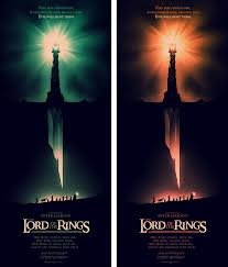
This is a piece I had used to research into my final major project, an artist by the name of Olly Moss. I really like the style this has been done in first I shall discuss the imagery used within the piece, this incorporates elements from all 3 Lord of the Rings movies, the broken sword of the king (Return of the King), Sauron’s Tower (The Two Towers) and the Fellowship walking across the mountain side (The Fellowship of the Ring). I loved how the Tower of Sauron had become the hilt for the King’s sword whilst the blade of this sword had made the area the Fellowship is walking across look like a cavern/chasm. This is a very nice touch and shows the in-depth and well worked detail in this particular piece of work and as I do with all of Olly Moss’ work, I’ve enjoyed the aesthetics and visuals included as they are always smart and precise elements of work.


Akira Toriyama:

Most recognise him due to his work on the highly successful manga and anime, DragonBall/DragonBall Z/DragonBall GT. I’ve taken a lot of my character design form this man especially in my spare time, I enjoyed boosting my drawing potential through the use of drawing his characters and a lot of them turned out rather well actually, this also helped me further develop anime style and comic style character design which I had actually incorporated into my character design and portfolio pieces as I displayed my own drawn work which I had worked on at home. I take a lot of my influence from him mainly in my out of college work, but I do still take a lot of influence from him. His style incorporates very straight edge faces on many characters, and large hair on many other characters too, in a few cases the characters actually do not have these sorts of faces. The eyes are normally rectangular with circle/semi-circle pupils. I really love his style, even the old 90’s designs he had done which done looked the best, I am still amazed by and influenced by to this very day, his work is a strong point in comic and manga style characters, that many other manga designers and readers have taken influence from due to the hugely celebrated series that is DragonBall.


Walter Gropius

Gropius was a man who was a German architect who then founded the school of Bauhaus (House of construction, stood for School of Building); Bauhaus was used in Architecture, Graphic design, Interior design for houses. This style is one I had seen before but never really had thought about, the architecture, still used in the modern day of architectural design, is often square or very straight edge buildings that are often use with plain colors, white and grey for examples of this although they never look plain even with these bland colors, in m7y opinion the style of the buildings today, which are influenced by the Bauhaus style are often the most aesthetically pleasing, which is a really impressive feet to say the movement is over a century old yet still considered a very new look or very modern day looking piece of architecture.


Claude-Oscar Monet

Monet was one of the founding fathers of the impressionist movement and the most prolific practitioner of the movement’s philosophy of expression their own perspective and perceptions of nature rather than just the plain, old view of the landscape that had been laid before the artist.
The picture above is one I have been instantly attracted to, it displays a dark castle looking structure in the background and a sea that is reflecting the sun in the sky and shows the shadow created by the hills beside it. The use of colors and many other shades created a masterpiece that adds great detail and a unique perspective from the artist, which the impressionist movement philosophy represents. The many colors almost like auras, especially around the sun with the white representing the middle and hottest point, spreading to yellow, then orange then red. I found it interesting that the sky isn’t just one color or just a couple of shades of the same color, this could be showing an aurora which can be seen as northern lights, although I am not sure, but this is my take on the piece, the unique things like that is what drew me to this picture and I believe it capture both a light and darker element. The darker element is the shadows and looming, dark castle upon the hilltop that casts a great shadow across the raging sea and the lighter side is the sun’s reflection on the water, creating a break within the dark shadow and giving it life in an area. Again this is only speculation to what he wanted us to see but this, in my opinion is a great piece that has multiple interpretations, but I do believe this was intended as the almost “Beauty lives in the eye of the beholder” style motto the Impressionists had gave way to allow the view to extracts a different interpretation than the artist, or maybe even the same in some cases.


Saul Bass
Saul Bass is a graphic designer who focuses on areas mainly to do with movie posters, a lot of his work includes very few colors that often tend to be different tones of the same color, there are two key colors that I see in many of his posters black and orange.
These oranges vary from a dark almost red orange all the way to a softer, less strong orange shade. I liked his style due to his silhouette style, though these silhouettes will only appear over key features of the poster, one example is the poster for “A tale of two cities” where the silhouette covers the Eiffel tower and Big Ben, he uses this to show only what he needs to show to make it recognizable as well as highlighting the key points within the posters. I had also used one of his styles in one of my pieces, I had used The Hangover official movie poster and gone over it with the pen tool, I then used 2 different shades of orange and black to limit myself to the style in which Bass used in his work, to this day I believe this is one of my best pieces I’ve done as the styles look well to match his as well as being able to make 4 posters, rearranging the colors and making it black and white without using more than 3 colors each time in my pieces. Another style in his pieces is the very simplistic back grounds, in both examples above its 2 different colors and in The Lord of the Rings one it’s only 2 different shades of gray, this is also another way to highlight as not being a key focus in Saul Bass’ Work.
Jonas De Ro is a Photoshop artist who uses Adobe Photoshop to create a scene from a picture, he does this through both adding and taking away features from the picture and changing many of the visuals to match his idea, this is his specialty, photo-manipulation. His specialisation within this area is Concept are, both of characters and landscapes within games.

This is a piece he created using a landscape of New York, it's name as "The Ruins of New York", this piece may have been created by simply using the picture of New York, taking away or covering areas of the city to make it look like it had been damaged after applying other effects to show damage and making the sky appear through newly formed buildings with missing chunks, as if it had been hit with a gun or rocket of some sort. It is interesting to see the way in which a landscape can be altered and manipulated into a piece of futuristic wasteland that we could only imagine and maybe never see, this is why concept art is amazing, it give freedom to the creator to both create and expand on different areas, literally making the world their playground.

Vincent Van Gogh
Vincent Van Gogh was a Post Impressionist artist, Post Impressionist were artists who were influenced and inspired by the artwork of the impressionist movement but rejected the constraints it beheld and they further ventured into their own, unique styles which were more emotionally based than Impressionist based.
He painted many self-portraits with strange wavy and spiraling patterns, seen in quite a few pieces of work he had produced; this was often based and represented the night’s sky. These spiraling patterns could also represent emotion. As this was the case of the post-impressionist artists had followed, but I am not certain, yet I appreciate the passion and emotion held within their work. All of his artwork featured many colors, building up a greater and more detailed piece of art that had a good arrange of colors to represent shadows, sunlight and other natural factors within the area. He also did landscape paintings, this is where it shows the inspiration of the impressionist artists, and this list could include such artists as Claude-Oscar Monet, who is considered one of the most famous artists who was apart of the impressionist movement. His style of work is almost strange, due to the patterns he had used in the sky and backgrounds of his work, although I believe this had been one of the factors that had made him original, maybe seeing something within the sky that represent his emotions, though others may not have seen.  Within his time he was only seen as a crazy and even delusional man, he had heard vices and spent time in an asylum, this is may have been why he never had seen success within his own time, yet now he is considered among the greats within the arts, within impressionist style and post impressionist style paintings within the modern day.